Here's a chart from Calculated Risk:
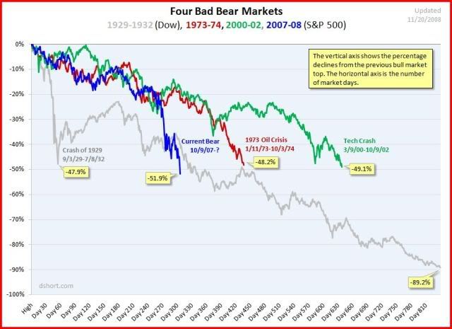
The green line is the tech bubble bursting; the red one was the first oil shock. The long one is the Depression.
And the blue line? That us now.
The chart shows stock market fall plotted against days since the crash begins. You can see, boys and girls, that the current nosedive is steeper - that is, a lower point "achieved" earlier - than in any other, including the big D.
Technorati Tags: Depression,stock market plunge
No comments:
Post a Comment